Opening Reception
Friday, March 30, 6 - 8 pm
For many years, Miami-based graphic designer Richard Massey has been researching the re-use of Modernism’s most iconic expressions for design applications. One notable example is his design for Cabinet Magazine’s logo, which is derived from the fragmented elements and ligatures of an early 20th century stencil often used in Le Corbusier’s architectural drawings and manifestoes.
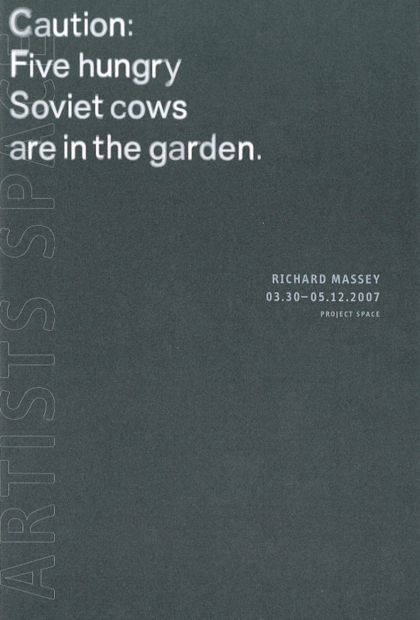
In his new project at Artists Space—Caution: Five Hungry Soviet Cows are in the Garden—Massey explores ideologies of neutrality in modernist type design. The desire for pure, objective communication has always been a core aspiration of Modernist typography, and remains so to this day. But how best to achieve this objectivity? Massey argues that every font designed to approximate a status of pure neutrality, a degree-zero of signification, is helplessly infested with the traces of its times, ideologies, and value judgments. But what holds true for fonts as a whole, Massey observes, may not be the case for individual letterforms within the various typefaces. Often, individual letterforms come close to pure non-propositionality, while other letterforms in the same font act as indicators for the mentality of their period. Rather than proposing a new non-propositional typeface—and thus trafficking in the same ideological mold as previous modern practitioners—Massey proposes to combine the most non-propositional letterforms from different typefaces into a new font: the perfect vehicle of non-signification, or, as Massey puts it, “the perfect typographical butler, always performing its task without complaining under its breath.”
To illustrate the application of this newly derived font, Massey makes use of pangrams, nonsensical sentences used by graphic designers to show type in context. Every sentence features each of the alphabet’s twenty-six letters at least once, and is composed of existing words. Pangrams exist in every language, and the most common one in English reads: “the quick brown fox jumps over the lazy dog.” In the gallery, Massey presents a pangram in the artificial language Lojban, which was developed to create a culturally neutral, unambiguous, completely logical language with phonetic spelling and no irregular rules. The pangrams are spelled out in a video projection, a Plexiglas sculpture, and the accompanying exhibition brochure, also designed by Massey.
Playful and ironic, Massey redeploys previous, utterly serious attempts at neutral communication and signification and turns them into an arena for the contemplation of what constitutes a neutral image.