Artists Space

Dexter Sinister: "Identity"

October 30, 2011 – January 15, 2012

“Identity” is an exhibition that charts the emergence and proliferation of graphic identity since the turn of the twentieth century, with particular reference to contemporary art institutions – museums, galleries, and so-called alternative spaces.
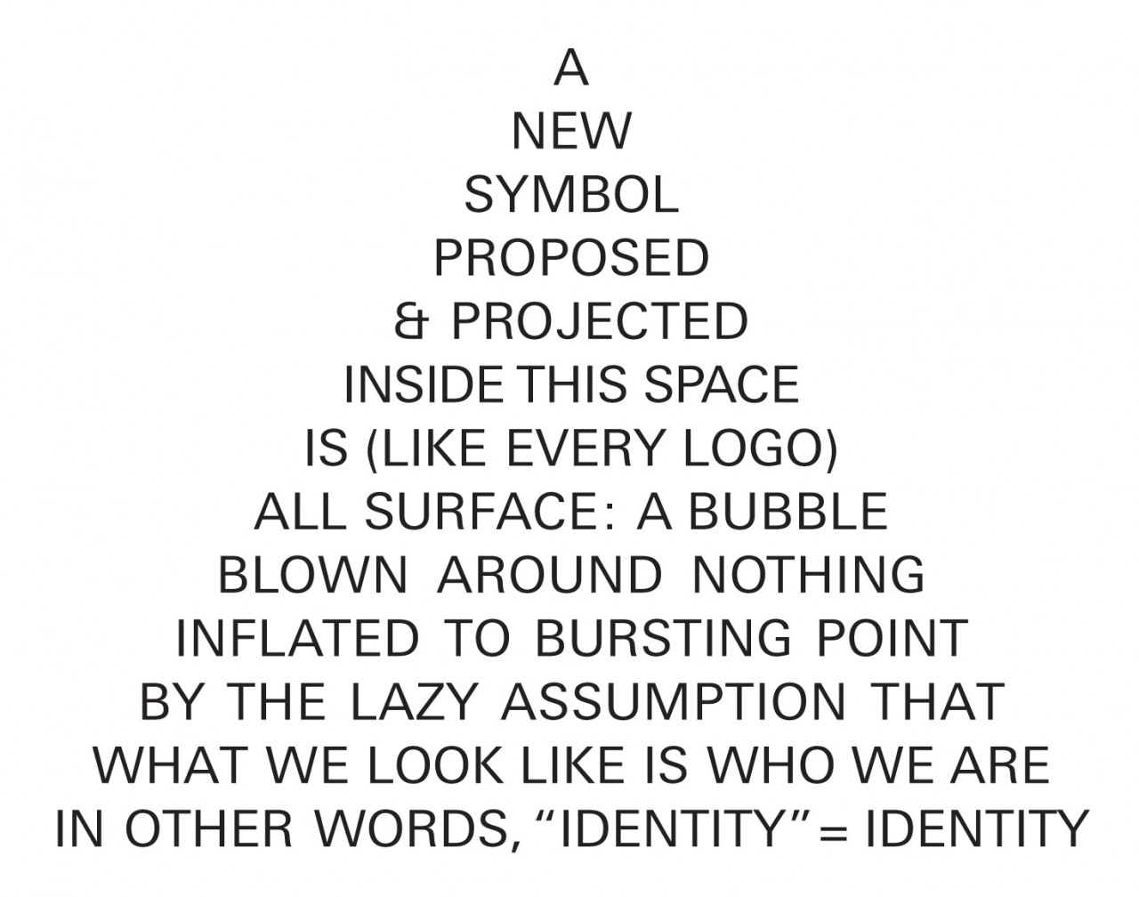
A simple graphic of words forming the shape of a triangle reads, "A NEW SYMBOL PROPOSED & PROJECTED INSIDE THIS SPACE IS (LIKE EVERY LOGO) ALL SURFACE: A BUBBLE BLOWN AROUND NOTHING INFLATED TO BURSTING POINT BY THE LAZY ASSUMPTION THAT WHAT WE LOOK LIKE IS WHO WE ARE IN OTHER WORDS,
[A simple graphic of words forming the shape of a triangle reads, "A NEW SYMBOL PROPOSED & PROJECTED INSIDE THIS SPACE IS (LIKE EVERY LOGO) ALL SURFACE: A BUBBLE BLOWN AROUND NOTHING INFLATED TO BURSTING POINT BY THE LAZY ASSUMPTION THAT WHAT WE LOOK LIKE IS WHO WE ARE IN OTHER WORDS, 'IDENTITY' = IDENTITY."]

The danger is that it’s just talk. Then again, the danger is that it’s not. I believe you can speak things into existence. - Jay-Z, Decoded , 2010

The period since the 1960s in particular has seen significant shifts in the perceived role of contemporary art in society, as well as the impact organizations displaying art have on economic and political infrastructures (and vice versa). “Identity” attempts to animate the typically fraught relationship between cultural and corporate spheres, as contemporary art institutions become increasingly preoccupied with their own image. How do changes in the graphic identities of art institutions over the last five decades reflect the shifting landscape of institutional policy and strategy? How does the conception of “Identity” – through an organization’s use of graphic design, its marketing and branding – function to mediate between audience, artwork, and institution?

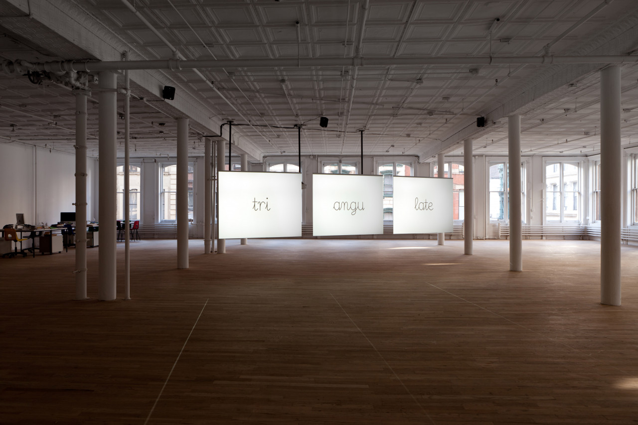
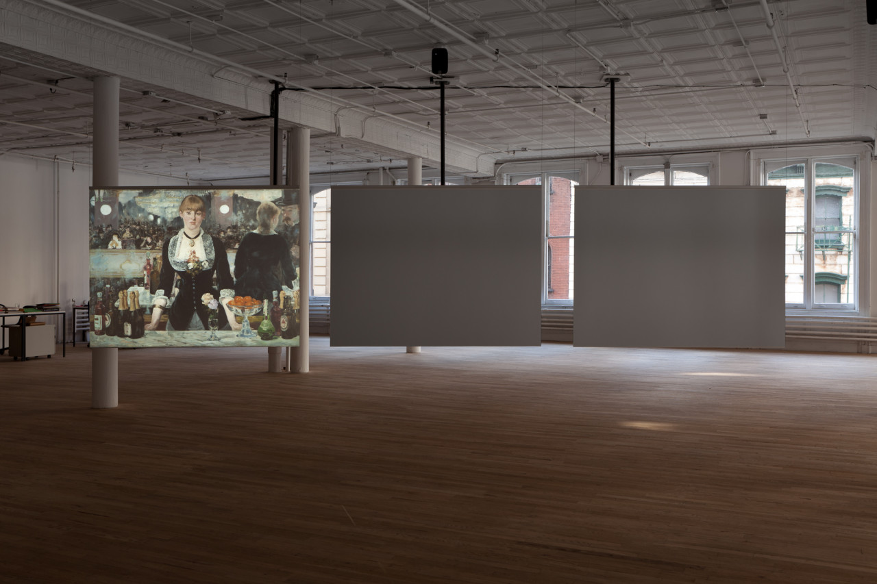
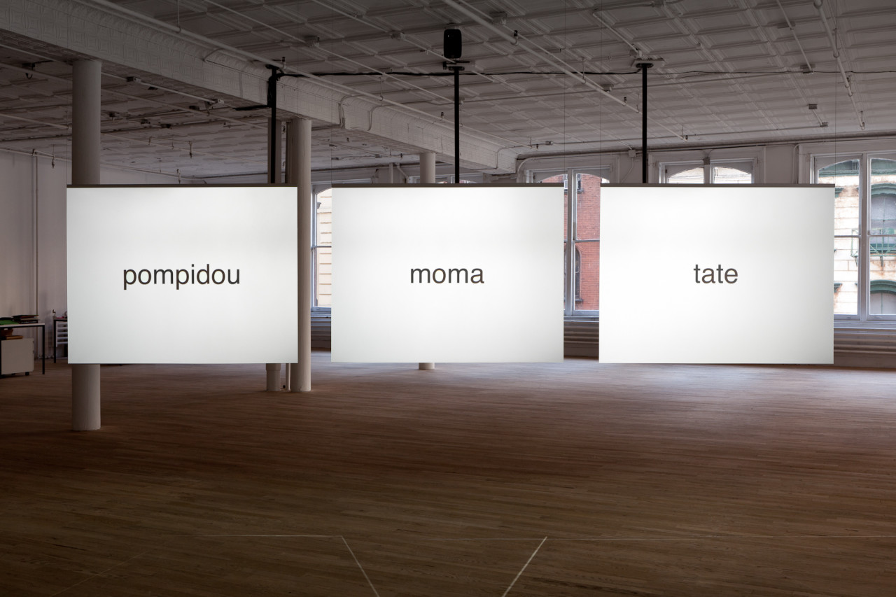
Initiated by Stefan Kalmár and Richard Birkett of Artists Space, “Identity”has been developed over a two-year period by Dexter Sinister – the working name of designers, publishers and writers Stuart Bailey and David Reinfurt – with research assistance from Robert Snowden. The resulting exhibition centers on a three-part projection that functions as part informational film, part minimalist cartoon. This audio-visual essay uses three case studies – London’s Tate, the Museum of Modern Art, New York, and the Centre Georges Pompidou in Paris – as coordinates from which to plot a broader landscape. Looking at the evolution of their ‘brands’ over the last fifty years, the film projects how art organizations negotiate their positions on a spectrum of ideology and economy.

October 22, 2011

The Whole of Troy is a Horse
Talk
3pm

December 4, 2011

Junior Aspirin Records
Listening Session
7pm

December 10, 2011

John McHale:
The Expendable Reader

Book Launch & Conversation
7pm

Three adjacent panels, reading "pompidou", "moma", and "tate" in black text against a luminous white background hang in a dimly-lit exhibition space.
"Identity". Installation View, Artists Space, 2011. Photo: Daniel Pérez. [Three adjacent panels, reading "pompidou", "moma", and "tate" in black text against a luminous white background hang in a dimly-lit exhibition space.]
In a dimly lit room with light wood flooring and white pillars, three illuminated panels are suspended from the ceiling in the distance. The panels each display a single word—"tri", "angu", and "late"—in a cursive font.
"Identity". Installation View, Artists Space, 2011. Photo: Daniel Pérez. [In a dimly lit room with light wood flooring and white pillars, three illuminated panels are suspended from the ceiling in the distance. The panels each display a single word—"tri", "angu", and "late"—in a cursive font.]
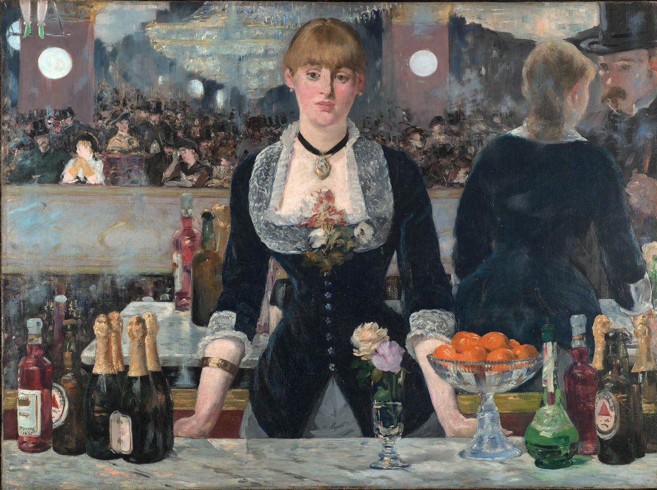
In a dimly lit room with light wood flooring and white pillars, three illuminated screens are suspended side-by-side from the ceiling. Two of the screens are off. The screen to the far left displays an image of a 19th century painting of a female bartender.
"Identity". Installation View, Artists Space, 2011. Photo: Daniel Pérez. [In a dimly lit room with light wood flooring and white pillars, three illuminated screens are suspended side-by-side from the ceiling. Two of the screens are off. The screen to the far left displays an image of a 19th century painting of a female bartender.]

This project is supported by The Graham Foundation for Advanced Studies in the Fine Arts, The New York State Council on the Arts, a State Agency, public funds from the New York City Department of Cultural Affairs, in partnership with the City Council, and The Friends of Artists Space.