Artists Space
About this Website
Inspired by its physical building with two entrances (11 Cortlandt Alley and 80 White Street), the website also has “multiple entrances.” Specifically, the website’s subdomains (images.artistspace.org, texts.artistsspace.org, videos.artistsspace.org, artists.artistsspace.org) aim to make the website’s content more accessible. They do this by presenting these media objects (images, texts, video) that are also accessible within the website’s pages in a more flat and ambient way, allowing generous traversal through Artists Space’s rich archive.
Image descriptions, or "alt text" on websites aid the visually impaired—images are understandable through short written textual descriptions, which are able to be parsed by screen readers and output via a synthetic voice or braille display.
During my research phase, before I started designing the this website, I noticed Artists Space was already presenting exposed image descriptions on their Instagram. By "exposed," I mean that typically, image descriptions are embedded in a website or app's code as "alt text"—which is typically invisible to sighted people and only parsable through a screen reader. To expose this meta text was a clear choice by the institution.
I began to think of an image description as an additional "entrance" into the world of an image, a way of giving new perspective or insight. Who writes these image descriptions? What does it tell us about not only the work but the interpreter of the work? (These questions were inspired by the project "Alt Text as Poetry," a project by artists Shannon Finnegan and Bojana Coklyat.)
So on this website, artistsspace.org, you'll find all images and videos have accompanying textual descriptions. While exposing metadata makes a thing "heavier," we find it is also generous, offering an alternative portal.
A favicon (short for "favorite icon") is a small icon that appears near the web browser's address bar. (It also appears next to individual entries in web browser history and also next to a saved web bookmark.) Most websites have unique favicons. If it’s a company or brand’s website, typically the favicon is a minified version of its logo. But in the case of an individual or artist, often the favicon is more expressive. But what about an institution?
In designing Artists Space's website, I wanted to consider some aspect of the website a separate but linked exhibition space to its physical location. So the favicon seemed like the perfect "space" to exhibit artist work. Similar to exhibitions, it could change contents and be reimagined by artists on a regular basis.
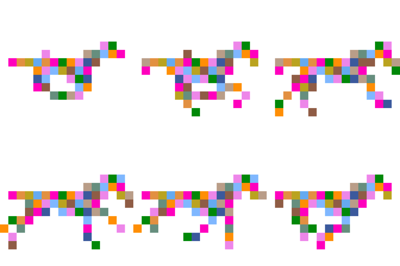
I created the first favicon, an animated galloping horse. I chose a horse because horses were my favorite drawing subject as a child, serving as my personal introduction to art. More broadly, the horse appears prominently throughout art history. The very first (cave) paintings were horses. And in 1848, Eadweard Muybridge captured sequences of a horse's gallop to finally answer the question, "When a horse gallops, does it ever become fully airborne?"
The favicon changes away from the horse if you land on an individual artist's page. It becomes a unique shape derived from the name itself. These shapes were algorithmically generated by Taichi Aritomo, who programmed this website.
One other specific characteristic of this website is its changing state. After sunset New York time, this website changes from day to night mode. At night, the text is white and background is midnight blue. As its implicated by the website, it mades sense for the favicon always to have two states.
During the day, the horse favicon is composed of various colors, each occupying the space of a single pixel. These colors exist behind images before they load on this website. During the night, the horse is a solid midnight blue to match the website.
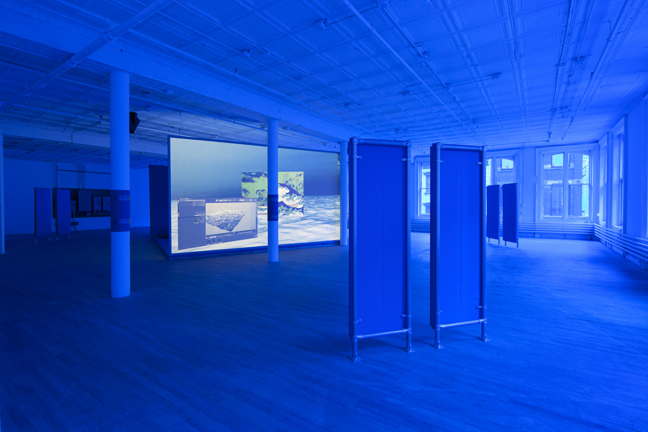
The website aims to be surfable, like the original web—before search engines. Hypertext, or the link element, is default blue and underlined. Links are oxygen, helping you go from place to place. Hopefully the website conveys unknowable depths, like artist Tom Bubul outlined in his own website's tenets.
This website went live in the early morning hours of October 29, 2019. Special thanks Taichi Aritomo and Mark Beasley who developed the website, Eric Wrenn for the new identity, and the Artists Space team (Jay Sanders, Stella Cilman, Hana Tran, Jamie Stevens, and Miriam Katzeff) for their dedication to manifesting this vision together.
— Laurel Schwulst
